Will output optimal graduation mark based on current students, phi, and tau values. Instructions on how to run are found in Introduction to Graduation.
Leaderboards for highest τ and publication multi of each theory, highest positive and negative ρ of each lemma, highest overall and minigame stars, and a monthly updated cross platform F(t) rankings.
Get confused with all the variables in T1-T8, MF, BaP, FP, and TC? Get tired in calculating the ratio of to other variables? Tired of checking the sim for purchasing variable? Here introduce a convenient tool to instantly check which variables to buy next! All u need is the levels of the variables at the current stage, and it will calculate automatically for u! Made by Hackzzzzzz.
Get lost which theory you should push next for T1-8 and the CTs? Use the Next Theory to Push Calculator to help you decide. Originally made by d4Nf6Bg5.
Centralized sheet with all currently finished and in-development Custom Theories. All future official Custom Theories will be on this sheet before they become official. Message @a_spiralist or @jooo_1265 on the Exponential Idle Discord for updating, fixing, and general sheet editing.
If you want to track your daily tau gains and contribute to daily tau rates graphs, request for access on this sheet. F(t) and Tau graphs available.
There are mainly 3 reset patterns used in MF CT depending on the of publication, namely reset, reset, and reset.
A definite criterion of and by comparing their cost and the cost for buying all variables before a reset is found, a similar criterion with excellent confidence has been found for , there is a moderate confidence of criterion when comparing and cost and the cost for buying all variables before a reset.
A publication table, like Basal Problem (BaP CT), is not likely but still possible in MF CT, where the theory published specific position may shorten total completion time.
Magnetic Field (MF CT) is a custom theory which is inspired by electromagnetism in physics. Despite the simple physics concept implemented in MF CT, the theory has additional reset features which complicated the theory in terms of the reset pattern, its influence on other variables (namely , , , , and ) and the length of a publication. Hence, a generalized investigation throughout the span of 9 months was conducted to explore the undiscovered criteria concerning the above-mentioned aspects of MF CT. Do note that the conversion of and in MF CT is in 1 to 1 ratio, hence (preferred) and described in MF CT may be used interchangeably in subsequent sections.
The following abbreviations will be used throughout the subsequent section:
Reset pattern – A rule in which a particle reset occurs when the rule is satisfied
reset – A reset pattern of which a particle resets when an additional level of , and all , , level with cost lower than that of additional level of are all purchased, is indicated for the gain of rho between reset as the cost of every reset differ by a magnitude of
reset – A reset pattern of which a particle resets when 2 additional levels of , and all , , level with cost lower than that of 2nd additional level of are all purchased, is indicated for the gain of rho between reset as the cost of every 2 reset differ by a magnitude of
reset – A reset pattern of which a particle resets when an additional level of , and all , , level with cost lower than that of additional level of are all purchased, is indicated for the gain of rho between reset as the cost of every reset differ by a magnitude of
Reset cost – The total cost of purchasing , , , and for a reset
of publication – The value of of last publication, i.e., the “Input” in sim 3.0
gain – The value of the gain of in the current publication
“Before” – The last level of designated variable purchased before the reset
“After” – The first level of designated variable purchased after the reset
A series of MF CT publication was simulated in sim 3.0 from to with step interval using best overall strategy (MFdCoast Depth: 0 : xxx, MFd2Coast Depth: 0 : xxx and MFd3Coast Depth: 0 :xxx) in depth 0 (No bruteforce). Due to the purpose of this investigation and my technical difficulties, investigation involving a higher depth was not used. Then, data set entries consist of the detail of reset positions, variable purchase positions, gain of of each of the 601 publications are obtained.
Data sets related to resets are isolated from the crude list to investigate the pattern of reset in each of the publication. The gain between reset is calculated and the reset data sets are excluded if the gain yields a result of or above, in which most of the data set are caused by rapid changes of and the reset pattern cannot be followed strictly by the simulator due to its manipulation limitation at the very start of a publication.
Subsequently, data sets related to resets, as well as the data entry which consist of a “Before”, a reset, and a “After” is isolated for determination of a criterion to compare the cost of levels and the cost of reset using ratio (i.e., “relative cost ratio” between , and reset cost before a reset.). The set of entry is included only if all three above-mentioned elements is included (i.e. a “Before”, a reset, and a “After”). For example, with the reference of Table 1 where the “Before”, a reset, and the “After” had been isolated. The relative cost ratio of “Before” compared to reset cost can be calculated by , while the relative cost ratio of “After” compared to reset cost can be calculated by .
877
Before
0.1737931
MFd3
Reset at V=139,59,117,36
44
878
After
0.3475862
MFd3
Table 1: An example illustrating the calculation of relative cost ratio
To determine the strength of a cost criterion as a cutoff, a Receiver-operating Characteristic Curve (ROC) is plotted using a series of cutoffs and the Area Under Curve (AUC) of the ROC is calculated. The exact cutoff position will be then determined by exploring the list of “Before” and “After” data with the aid of a box and whisker diagram. The approach is repeated for , , , and . More detailed explanations on the nature and interpretation of graphs will be explained subsequently.
Lastly, the reset pattern and the gain of each of the 601 publications will be retrieved for analysis of publication behavior and explore the relationship between of publication and the reset pattern used, which will be useful for predicting the pattern used in a publication without referring to the simulator.
A Receiver-operating Characteristic (ROC) curve is a common graphical plot visualizing the performance of a binary classifier by plotting True Positive Rate (Sensitivity; ) against False Positive Rate (1 – Specificity; ) across all classification thresholds, mainly in machine learning and the medical field. It demonstrates the trade-off between sensitivity and specificity, with higher curves indicating better classification accuracy.
With the aid of the above concept, we can design a threshold which is to effectively and correctly separate the list of variables purchased before and after a reset by their relative cost ratio (e.g., cost divided by reset cost). Take an example of as the variable and as the relative cost ratio threshold, the interpretation of result can be referenced by Table 2 and a set of data regarding “True Positive Rate” and “False Positive Rate” , or a point of ROC Curve, can be obtained.
relative cost ratio of “After” simulated by sim v3.0 (“Total Positive”)
“After” purchased in-line with the result from sim v3.0 (“True Positive”)
“After” wrongly purchased before the reset instead of after the reset (“False Negative”)
relative cost ratio of “Before” simulated by sim v3.0 (“Total Negative”)
“Before” wrongly purchased after the reset instead of before the reset (“False Positive”)
“Before” purchased in-line with the result from sim v3.0 (“True Negative”)
Sensitivity False Positive rate Table 2: Definitions and implications of positives and negatives with relative cost ratio as an example
Next, repeat the calculation with a variety of relative cost ratio threshold and obtain a set of data points regarding “True Positive Rate” and “False Positive Rate”. Plotting the dots in a graph will yield a ROC Curve. The Area Under the Curve (AUC) of a ROC curve is calculated to measure overall performance. An AUC of a ROC of indicates a perfect identification of “Positive” and “Negative” exists, while the AUC of a ROC of is no better than random guessing. The larger the AUC of a ROC, the better the performance of a classification threshold, if appropriately set. In summary, one can interpret a ROC Curve as indicated in Graph 1.
Graph 1: Interpretation of ROC curve
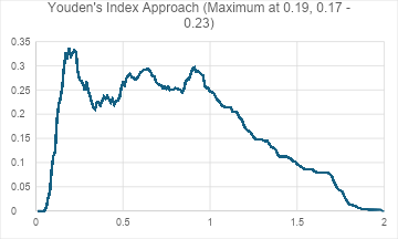
There are three approaches to determine the preferred threshold when no definite threshold can be established (i.e. AUC of ROC Curve less than ), namely Youden’s Index approach, minimal distance approach (MDA), and weighted approach. The Youden’s Index is calculated by Sensitivity Specificity (i.e., Sensitivity “False Positive rate”). Then the threshold will be determined when Youden’s Index reached maximum.
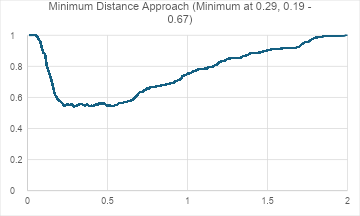
The minimal distance approach calculates the distance between dot plots of ROC Curve and an imaginary ideal situation (i.e., on a ROC plot) via. the formula , The threshold will be determined when the distance between the two mentioned point is at minimum. The final approach takes account of weighted factors in each situation, such as the time loss due to “incorrect” variable purchases. Since the factors and the weighting of each factor is subjective and can differ from user to user, this method will be omitted in subsequent considerations of relative cost ratio threshold.
A Box and whisker diagram is another common graphic plot visualizing the dispersion of a sets of discrete data, as well as the range, Lower Quartile (Q1), Median (Q2), Upper Quartile (Q3) and outliers, if any, of a data set in statistical analysis. In this investigation, a box and whisker diagram will illustrate the spread of data set, as well as giving an approximate picture of how a relative cost ratio threshold perform when compared to sim 3.0. With a box and whisker diagram, one can interpret as below in Graph 2.
Graph 2: Interpretation of a box and whisker diagram
A cumulative number of data set entries were obtained from sim v3.0. The data was further refined based on the aim of different investigations. Further details are presented in corresponding sections.
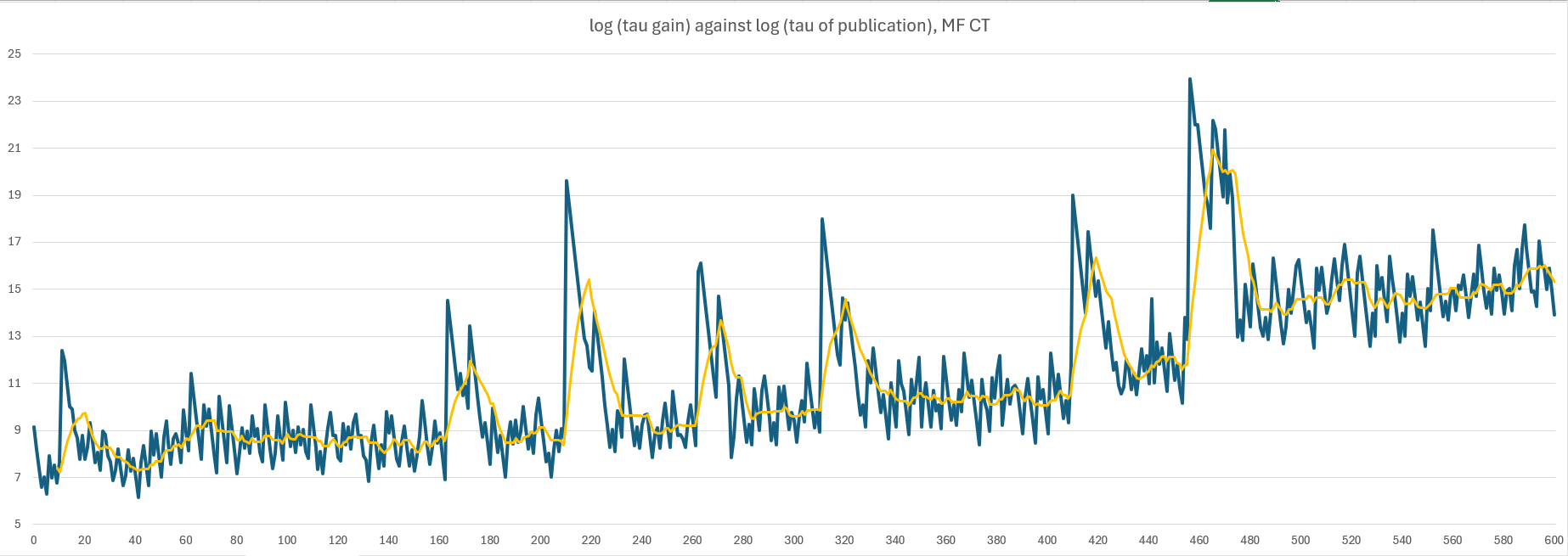
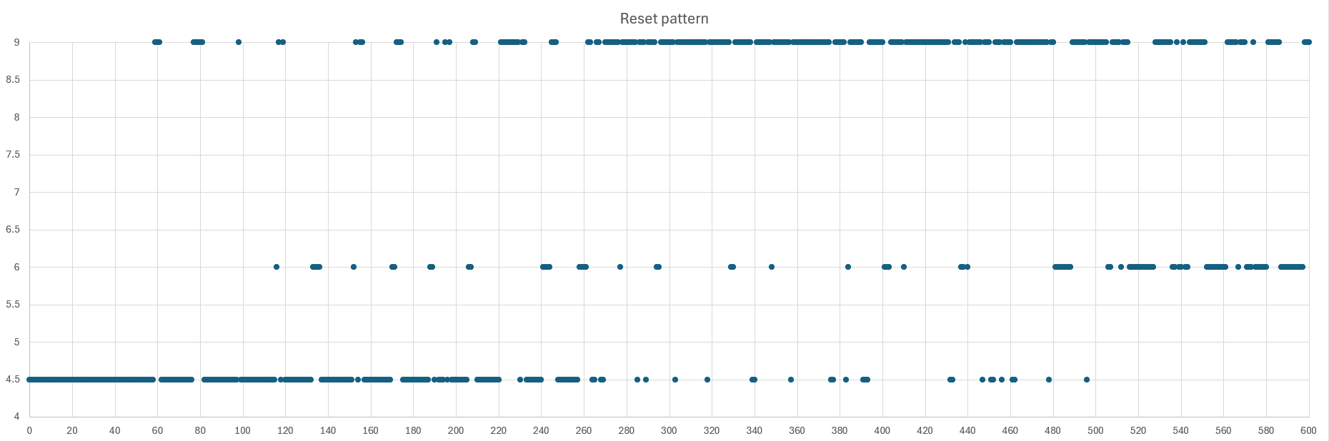
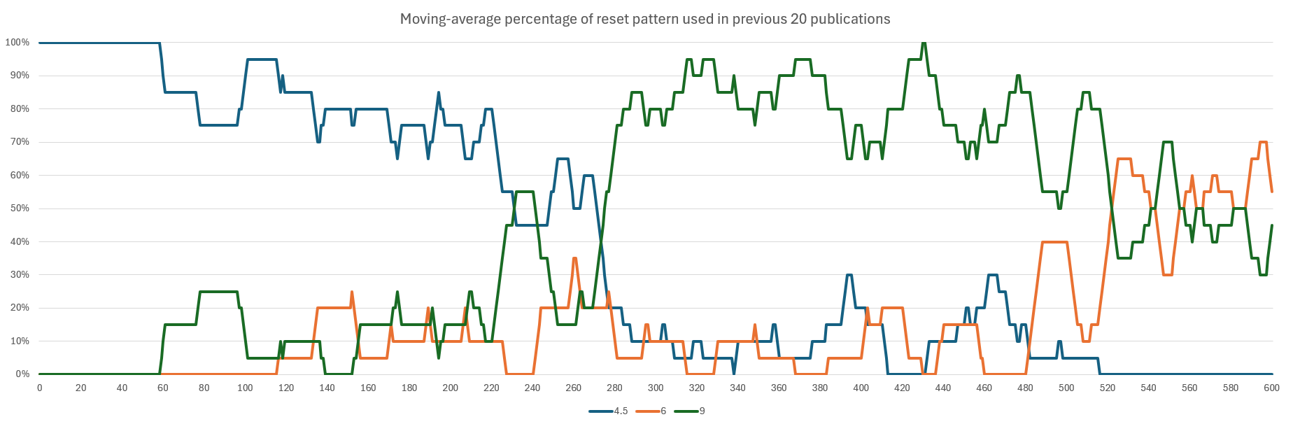
A total of data sets related to resets are isolated from the crude list corresponding to the of publication to investigate the pattern of reset in each of the publication. There are mainly three types of reset patterns used in different MF CT publication , they are reset , reset , and / reset . The use of three types of reset patterns in their respective of publication is presented below (Graph 3), excluding outliers, one can summarize that reset are the main pattern used before , then the pattern gradually shifts to reset and become the mainstream pattern after . The pattern continues until , when reset started to be increasingly used until . The trend of usage of reset pattern is illustrated in Graph 4.
Graph 3: Reset patterns plotted against of publication
Graph 4: Moving-average percentage of reset pattern used in previous 20 publications, each differing by of publication
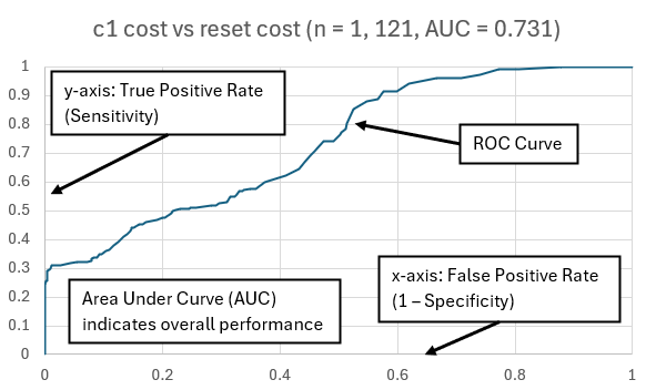
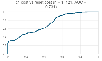
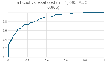
A total of sets of data entries consisting of a “Before”, a reset, and a “After” were identified from the crude data set and the relative cost ratio of “Before” and “After” were calculated and compared. A ROC Curve were plotted (Graph 5) and AUC were calculated to be indicating a moderate-strength threshold, if appropriately set, exists for cost vs. reset cost with a considerable number of inconsistencies. The accuracy of identifying “Before” and “After” using a series of relative cost ratio thresholds ranging from to with interval of and the corresponding Youden’s Index and MDA are displayed in Graph 6 and Graph 7 respectively.
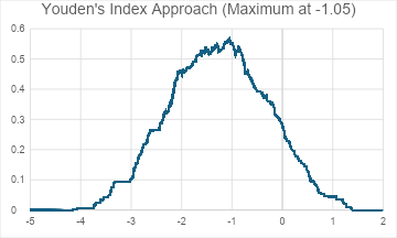
While Youden’s Index achieves maximum when relative cost ratio threshold is set at (Similar value interval ), distance from ideal via. MDA reaches minimum at relative cost ratio threshold of (Similar value interval ). Since Youden’s Index measures the greatest vertical distance between ROC curve and random guessing line (i.e., straight line connecting and of a ROC curve), using the lower relative cost ratio threshold calculated with Youden’s Index Approach ensures more “After” to be identified while the accuracy of identifying “Before” is significantly lower . On the other hand, using threshold from MDA usually ensures a balanced result, especially for skewed data. In this case, both identifying “Before” and “After” are considerably appropriate with the threshold of calculated above.
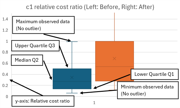
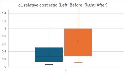
A notable mention is the minimum distance calculated in MDA remains at a low plateau from relative cost ratio to , in response to this, two additional relative cost ratios of and are evaluated. For relative cost ratio of , accuracies of identifying “Before” and “After” being and , while those for relative cost ratio of are and respectively. A box and whisker diagram comparing “Before” and “After” is illustrated below as supplementary information (Graph 8).
Graph 5: ROC curve of cost vs. reset cost , with AUC
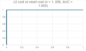
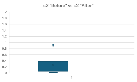
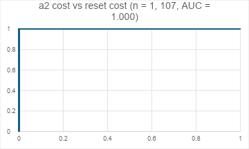
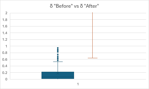
A total of sets of data entries consisting of a “Before”, a reset, and a “After” were identified from the crude data set and the relative cost ratio of “Before” and “After” were calculated and compared. A ROC Curve was plotted (Graph 9) and AUC were calculated to be indicating a perfect threshold exists for cost vs. reset cost. With reference to a box and whisker diagram comparing “Before” and “After” (Graph 10), a subsequent threshold of relative cost ratio was set to be and the accuracy of identifying “Before” and “After” were and respectively. This result can be interpreted as a threshold of relative cost ratio is definite for cost vs reset cost.
Graph 9: ROC curve of cost vs. reset cost , with AUC
Graph 10: Box and whisker diagram of relative cost ratio for “Before” and “After”
A total of sets of data entries consisting of a “Before”, a reset, and a “After” were identified from the crude data set and the relative cost ratio of “Before” and “After” were calculated and compared. A ROC Curve were plotted (Graph 11) and AUC were calculated to be indicating a moderate-to-good-strength threshold, if appropriately set, exists for cost vs. reset cost with a considerable number of inconsistencies. Since the relative cost ratio of spans across a considerable range of magnitudes, the relative cost ratio has been converted to to facilitate easier comparisons. The accuracy of identifying “Before” and “After” using a series of relative cost ratio thresholds ranging from to with interval of and the corresponding Youden’s Index and MDA are displayed in Graph 12 and Graph 13 respectively. A similar methodology described in “ cost vs reset cost” section was adopted. Both Youden’s Index Approach and MDA gives a consensus of an relative cost ratio threshold at , which indicates for the actual relative cost ratio threshold. In this case, both accuracies in identifying “Before” and “After” are relatively good with the threshold of calculated above. With a box and whisker diagram comparing “Before” and “After” illustrated below (Graph 14), it may be more sensible to set a threshold of , in which achieve an accuracy of for identifying “Before” and for identifying “After”.
Graph 11: ROC curve of cost vs. reset cost , with AUC
A total of sets of data entries consisting of a “Before”, a reset, and a “After” were identified from the crude data set and the relative cost ratio of “Before” and “After” were calculated and compared. A ROC Curve was plotted (Graph 15) and AUC were calculated to be indicating a perfect threshold exists for cost vs. reset cost. With reference to a box and whisker diagram comparing “Before” and “After” (Graph 16), a subsequent threshold of relative cost ratio was set to be and the accuracy of identifying “Before” and “After” were and respectively. This result can be interpreted as a threshold of relative cost ratio is definite cost vs. reset cost.
Graph 15: ROC curve of cost vs. reset cost , with AUC
Graph 16: Box and whisker diagram of relative cost ratio for “Before” and “After”
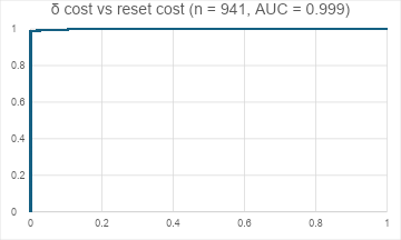
A total of sets of data entries consisting of a “Before”, a reset, and a “After” were identified from the crude data set and the relative cost ratio of “Before” and “After” were calculated and compared. A ROC Curve was plotted (Graph 17) and AUC were calculated to be indicating an excellent threshold, if appropriately set, exists for cost vs. reset cost with occasional inconsistencies. With reference to a box and whisker diagram comparing “Before” and “After” (Graph 18), a subsequent threshold of relative cost ratio was set to be and the accuracy of identifying “Before” and “After” were and respectively. This result can be interpreted as a threshold of relative cost ratio is excellent for cost vs. reset cost. The accuracy of identifying “Before” and “After” using other relative cost ratio thresholds and the corresponding Youden’s Index and MDA are displayed in Table 3. Both Youden’s Index and MDA are coherent in setting the relative cost ratio threshold as is more ideal than any other thresholds. The inconsistency of failure to identifying “After” was retrospectively found to be in some resets between to and publications. Using the relative cost ratio threshold as for may result in time difference compared to the simulation result.
Graph 17: ROC curve of cost vs reset cost , with AUC
Graph 18: Box and whisker diagram of relative cost ratio for “Before” and “After”
Relative cost ratio threshold
Accuracy in identifying “Before”
Accuracy in identifying “After”
Youden’s Index
MDA
0.6
835/941, 84.74%
941/941, 100%
0.8874
0.1126
0.7
872/941, 92.67%
934/941, 99.26%
0.9192
0.0737
0.8
900/941, 95.64%
934/941, 99.26%
0.9490
0.0442
0.9
925/941, 98.30%
933/941, 99.15%
0.9745
0.0190
1.0
941/941, 100%
928/941, 98.62%
0.9862
0.0138
Table 3: Tables showing accuracies, Youden’s Index, and MDA in sets of relative cost ratio threshold for
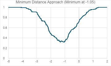
Throughout the 9 months of investigations, several hypotheses concerning the relationship between gain, of publications, and reset patterns have been proposed. First part of this investigation was to evaluate the effect of reset pattern on the gain of the publication, it was hypothesized that the rho difference between resets has some influence on the gain of the publication, which was disproved by a graph plotting against (Graph 19). The graph reveals no visible relationship between reset pattern and of the publication, despite several attempts using arithmetic mean, geometric mean, and root-mean-square (RMS) of data sets.
Graph 19: plotted against
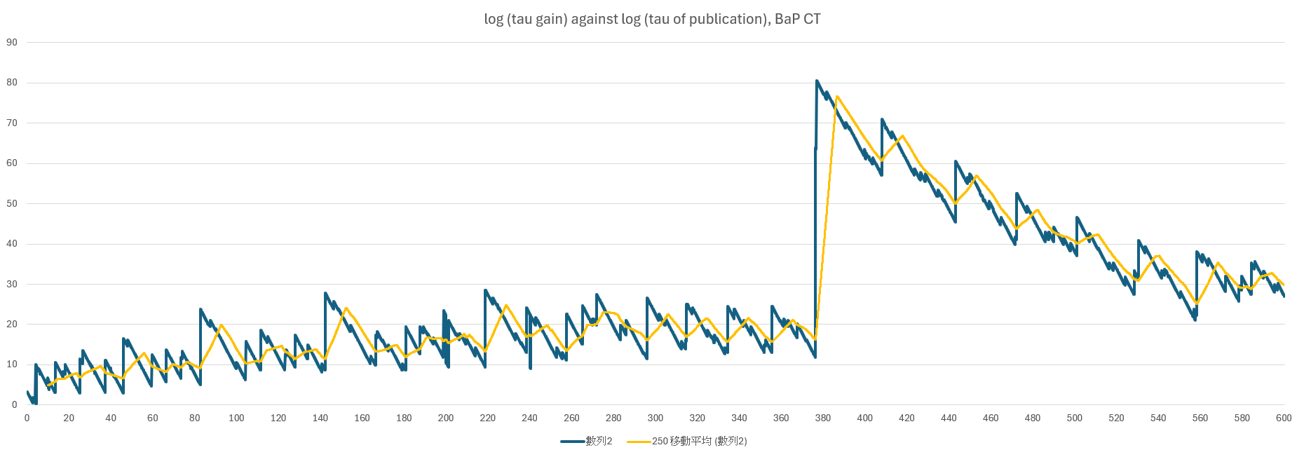
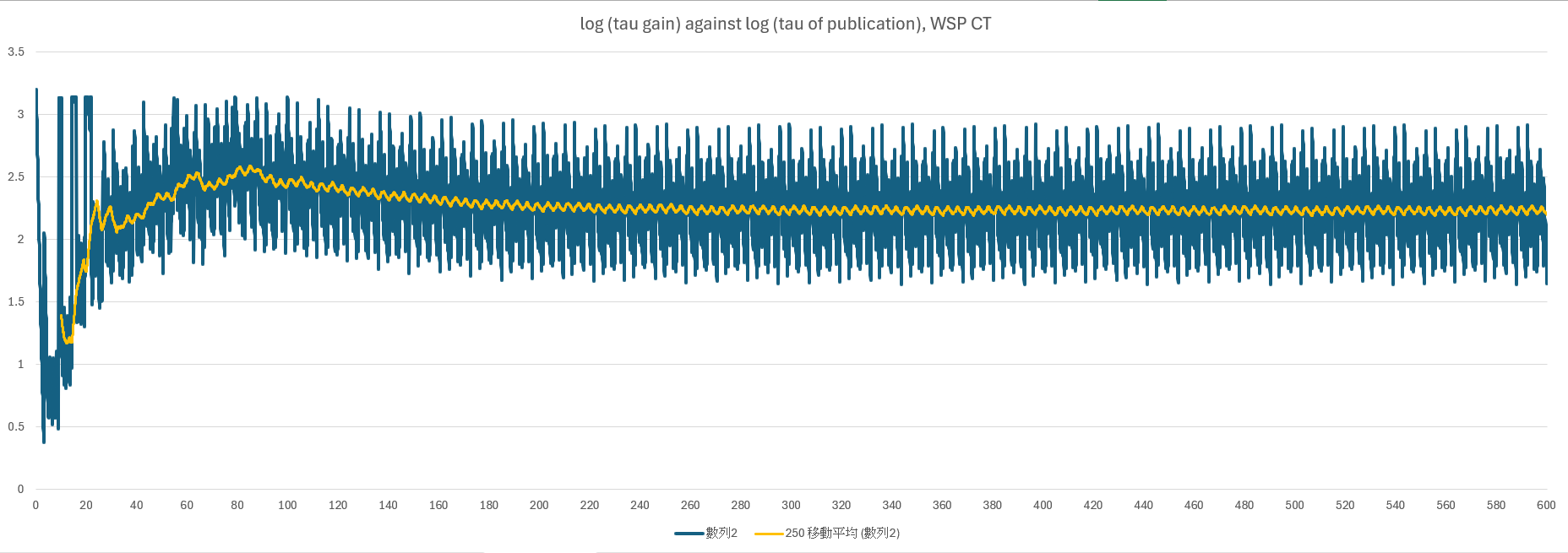
The second part of this section investigates the effect of of publication on gain in a publication and, hence, investigates the possibility of a publication table where one can complete MF CT at a shorter time with a series of set publication rhos. To verify the above investigation, the gain was obtained and plotted against of publication for MF CT and a subsequent moving-average of gain of the previous 20 was also plotted (Graph 20). Similar graphs were also plotted for Basal Problem (BaP CT; Graph 21) where a publication table is verified to be effective in shortening the completion time of BaP CT, and for Weierstrass Sine Product (WSP CT; Graph 22) where there is no publication table for comparison.
One can appreciate the moving-average plot for BaP CT is relatively spiky, while that for WSP CT is relatively a straight line with slight up-and-down despite highly fluctuating gain values. It is also noticeable that gain fluctuates more for publication that goes across a milestone when compared to other of publication when the publication does not go across a milestone.
With the graph plotted for MF CT comparing to the two controlled graphs, one can appreciates the moving-average plot for MF CT remains relatively straight but includes some spikes that has larger amplitudes than those in WSP CT but smaller amplitudes than those in BaP CT, with large fluctuation for publication that goes across a milestone. With the observation, one can conclude a publication table, like BaP CT, is less likely but still possible for MF CT. Finding the designated publication position was out of the scope of this investigation, subsequent investigation would be needed if any other evidence suggests a publication table.
The above investigations illustrate the fact that a generalized reset pattern across different of publication can be found in MF CT (with a considerable portion of unexplained exceptional cases). By investigating the relationship of relative cost ratio of , , , , and “Before” and “After” to reset cost, using a relative cost ratio threshold of on , , and is excellent in differentiating “Before” and “After” for a reset. Meanwhile, the strength of a relative cost ratio threshold of and is limited, and a range of the relative cost ratio of and was suggested with variable accuracies which need further evidence-based investigations to discover underlying criteria. The gain of the publication has no relationship with reset patterns, and a publication table is less likely but still possible for MF CT.
By recalling the formula of MF CT, one can simplify the formula for rho dot as follow,
Where , , and are exponents that only changes when corresponding milestones are used.
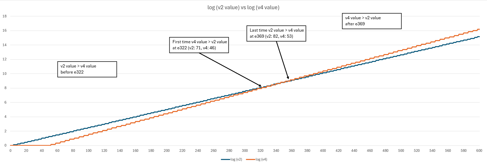
The underlying reasons for the transition of reset to reset from to are probably due to the increase dominance of (via. ) in growth of in respond to lengthened time between resets and milestone 5 and 6 (at and respectively) which increases the exponent of , hence lengthening the reset time to benefit additional due to by “combining” two resets into one single reset. As MF CT progresses, value of gradually increases and significantly account for the growth of with the effect of milestone 7 and 8 (at and respectively), such that the effect starts to overcome that of (See Graph 23), the reset pattern gradually transits again from reset to reset. However, the above hypothesis has not been verified and require further verification with account for the effect of on . The existence of outlier has also not been explained in this investigation; further evaluation is needed and underlying criteria may be yet to be discovered.
The above simulations were simulated in close to real-life situations when a game with proper , , , , and levels being purchased based on the criteria provided by MFd, MFd2, and MFd3. However, the above investigations were conducted in a static manner, while the real game in MF CT is a dynamic game progression with influencing (together with ) and, hence, . With the derivation of formula in previous section, one can conclude is proportional to , where depends on the number of milestone (i.e., before Milestone 5, between Milestone 5 and 6 and afterward). This may be the part of the explanation why the transition point from reset to reset at a later-than-expected rho. Further evidence will be needed in order to verify this hypothesis.
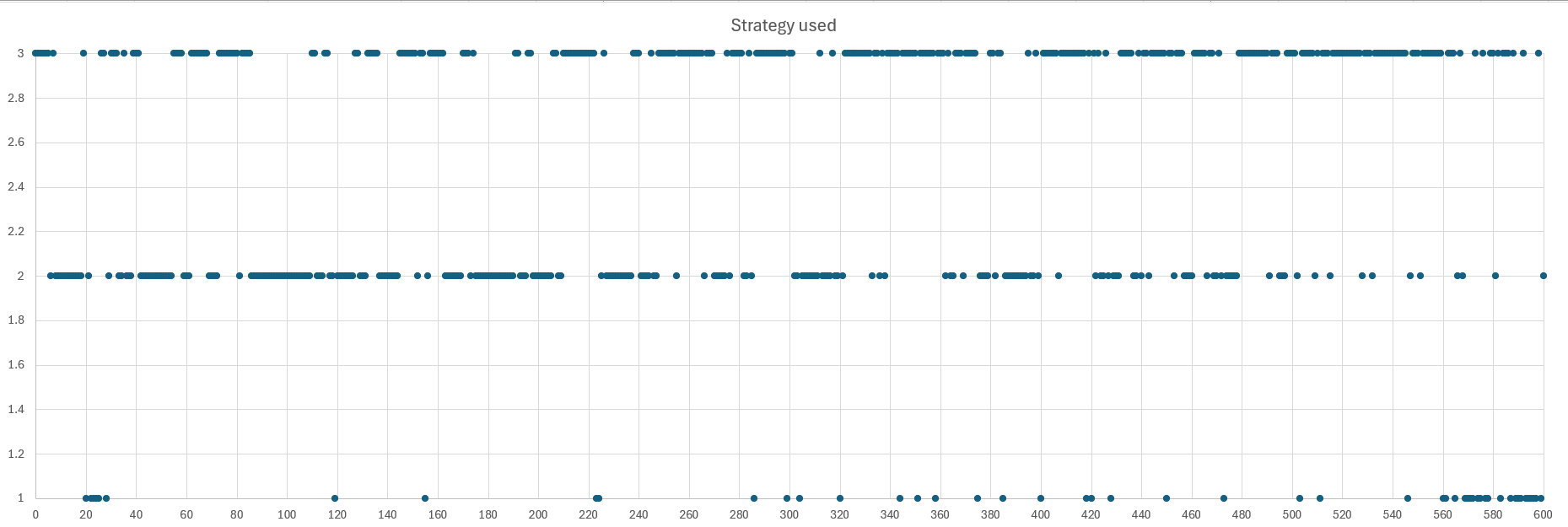
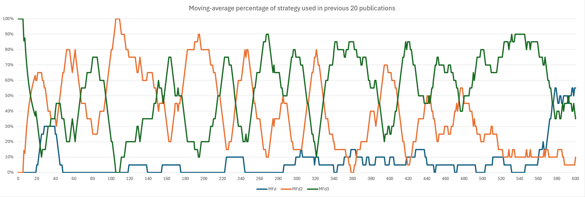
The MF CT publications were simulated by sim 3.0 using the best rate out of the three strategies developed by players – MFdCoast Depth: 0 : xxx , MFd2Coast Depth: 0 : xxx , and MFd3Coast Depth: 0 :xxx . The use of three types of strategy in their respective of publication is presented below (Graph 24). Together with the trend of usage of reset pattern is illustrated in Graph 25, one can summarize that MFd2 and MFd3 were alternatively used throughout MF CT, with MFd3 finally dominate over MFd2 after . The use of MFd were low until a gradual rise after , replacing MFd2.
Graph 24: Strategy used plotted against
Graph 25: Moving-average percentage of strategy used in previous 20 publications, each differing by of publication
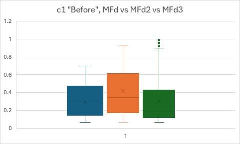
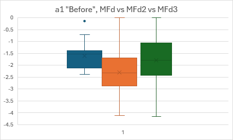
In this investigation, it is unclear that whether the strategy adopted in a publication altered the results of above investigations, especially on and relative cost ratio due to the three discrete buying criteria used in the three strategies. With respond to this, the and data sets were further divided into three groups based on the strategy used in the publication, their ROC Curves were plotted, their AUC of ROC Curve, Youden’s Index approach, and MDA were evaluated and compared, and the significance of the effect of buying strategies for and were compared in Table 4 and Table 5 respectively. Since the scale of cost for each level is and the scale of cost for each level is throughout MF CT, A box and whisker diagram comparing only “Before” and “Before” for three strategies have been plotted (Graph 26 and Graph 27).
AUC of ROC
Youden’s Index threshold
MDA threshold
p value
MFd
0.756
0.55, 0.56
0.53
As comparison
MFd2
0.745
0.92
0.62
<0.0001****
MFd3
0.736
0.19
0.23
0.1935
Table 4: Tables of AUC or ROC, Youden’s Index, MDA, and significance for when compared to MFd for MFd, MFd2, and MFd3
AUC of ROC
Youden’s Index threshold
MDA threshold
p value
MFd
0.973
-1.03 to -0.99
-1.03 to -0.97
As comparison
MFd2
0.890
-1.62
-1.62
<0.0001****
MFd3
0.856
-0.87 to -0.84
-0.87
0.06892
Table 5: Tables of AUC or ROC, Youden’s Index, MDA, and significance for when compared to MFd for MFd, MFd2, and MFd3
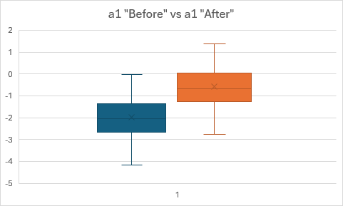
Graph 26: Box and whisker diagram of relative cost ratio for “Before” for MFd , MFd2 , and MFd3
Graph 27: Box and whisker diagram of relative cost ratio for “Before” for MFd , MFd2 , and MFd3
By comparing and relative cost ratio of publication using MFd2 with those using MFd, one may observe the relative cost ratio threshold used in publication of MFd2 is higher than that of MFd while that of is lower, and is statistically significant, reflecting the difference in and buying criteria alters the and relative cost ratio threshold. The comparison between MFd and MFd3 is insignificant as they share the same buying criteria in their respective publications. The reason for lower relative cost ratio threshold and higher relative cost ratio threshold in publication using MFd3 is yet to be known. To summarize, the adjusted and relative cost ratio should be adjusted accordingly depend on the strategy used in the publication, as described in Table 6. However, the underlying mechanism(s) for determination of strategy used in a publication has not been found in these investigations, which is essential for determining the and relative cost ratio threshold.
relative cost ratio threshold
relative cost ratio threshold
MFd
50%, or 0.5, or 1/2
10%, or 0.1, or 1/10
MFd2
75%, or 0.75, or 3/4
2.5%, or 0.025, or 1/40
MFd3
20%, or 0.2, or 1/5
12.5%, or 0.125, or 1/8
Table 6: Adjusted and relative cost ratio threshold used in MFd, MFd2, and MFd3
Lastly, I would like to give a huge thanks to the following people/group of people for assisting the verification of hypothesis and further findings on MF CT:
Mathis S.
For designing the MF CT, suggesting some hypothesis to be verified and designing simulation for MF CT via. sim 3.0 for data retrievals.
Hotab, basically, i am little cat
For designing simulations for MF CT for data retrievals and refine the hypothesis upon testing.
Maimai, Black Seal
For suggesting the strategies used in MF CT.
All other people
For providing experimental data and providing support whenever I need them.

![Graph 19: [log10 (ρ gain)]/[log10 (reset pattern ρ)] (y) plotted against log10 (ρ of publication) (x)](/images/mf/graph_19.png)